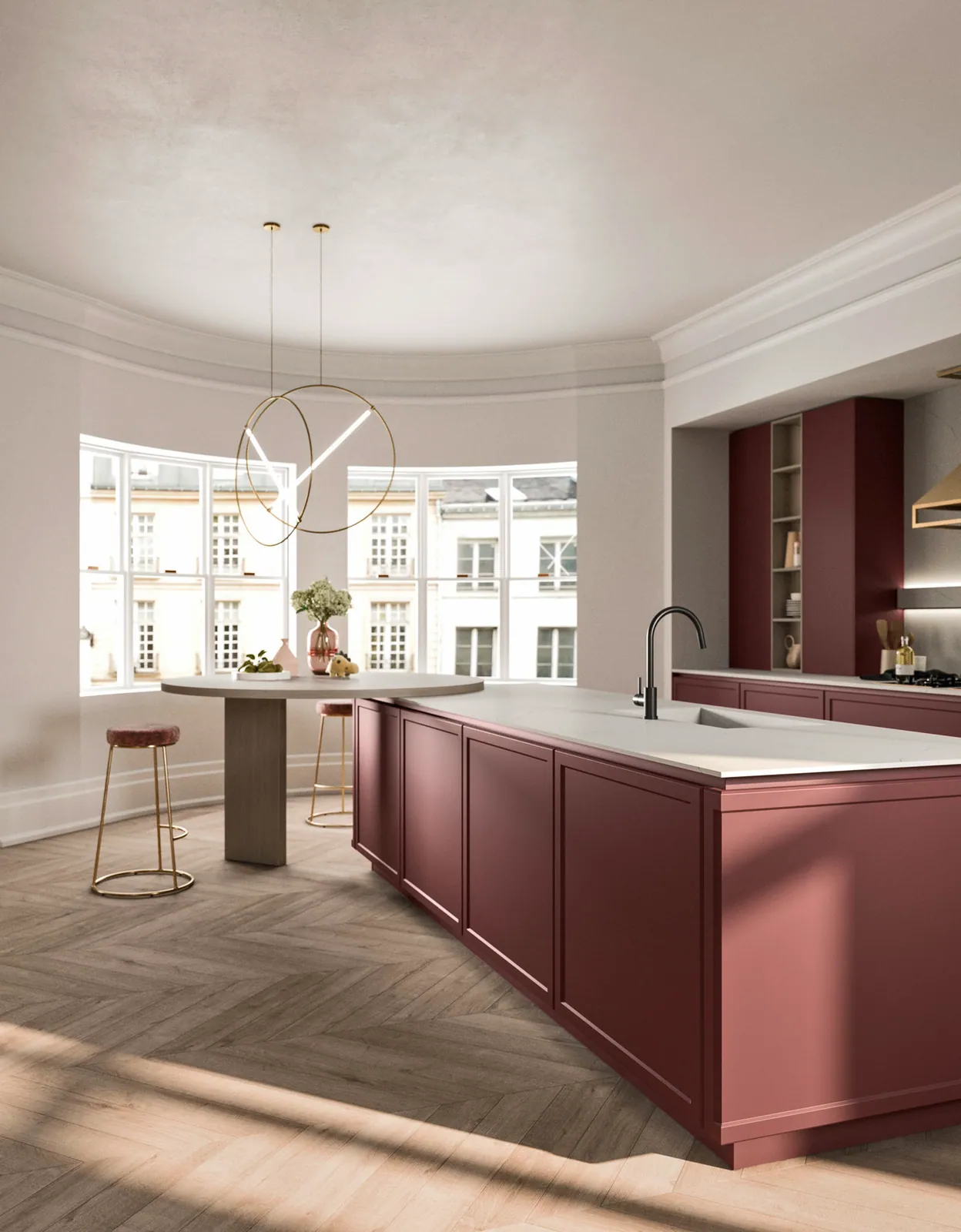
Only a few years ago, a kitchen was expected to gleam. Today it is the opposite: we look for the material that absorbs light rather than bouncing it back. Matte lacquer has established itself as that discreet, almost silent signature of contemporary interiors.
What strikes you first is what it does not do. No reflection that catches the eye, no halo of light that distorts the surface, no bright streak when the sun grazes the front. Matte lacquer stays settled, even, deep. A full-height cupboard door ceases to be an object and becomes a stretch of wall. It is precisely this calm that you look for in an open living space, where the kitchen shares the room with the sitting area.
A depth that shine does not have
Matte does more than hide reflections. It gives colour a particular density. A matte black looks blacker, an anthracite denser, an off-white softer. The shade does not float on the surface: it seems to come from within the panel. To this is added the touch. A quality matte lacquer is pleasant under the hand, slightly velvety, without the smooth coldness of glossy surfaces.
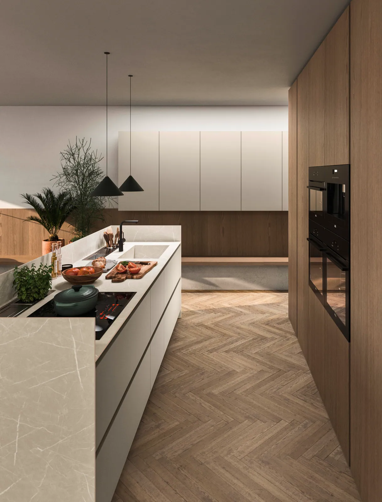
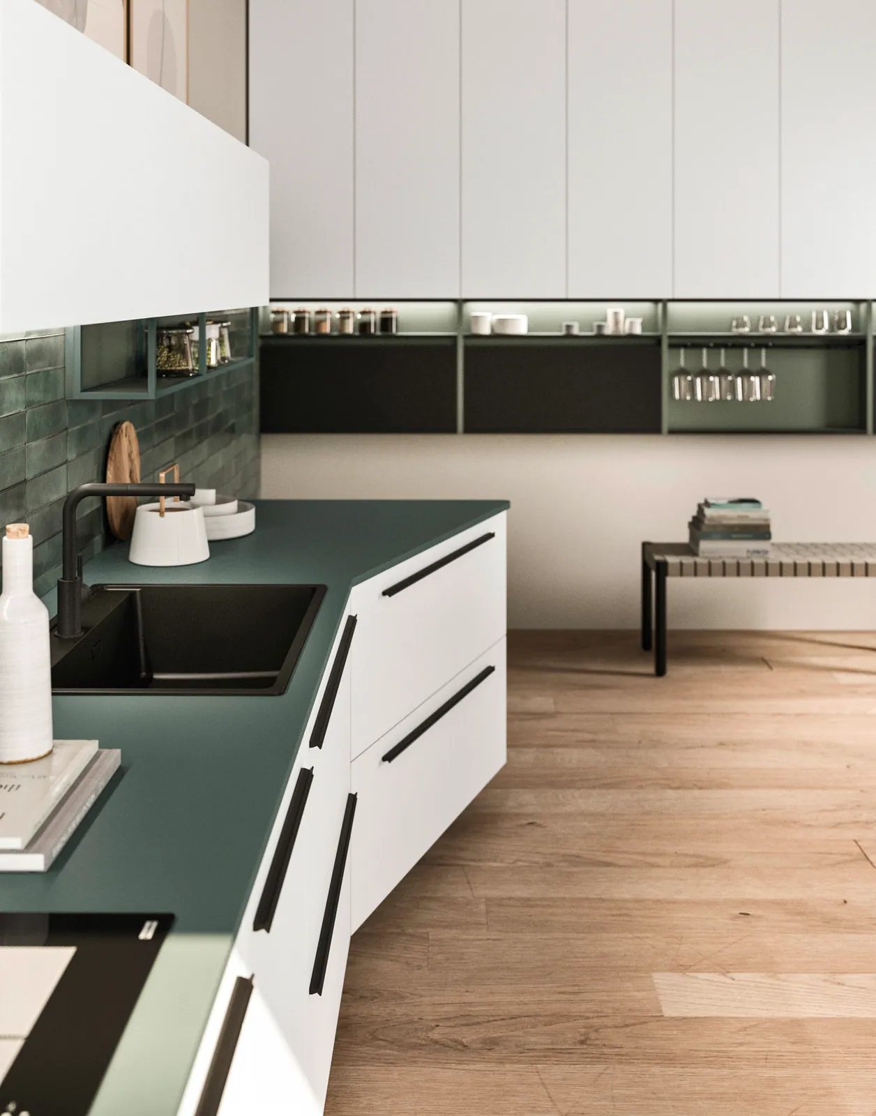
The palette follows this same logic of restraint. Muted shades reign here: deep black, anthracite, taupe grey, forest green, sand beige, off-white. These are colours that do not shout, that age well and that pair with wood, stainless steel or glass without ever competing with them. A matte lacquer front knows how to fade away and let a worktop or an oak grain speak.
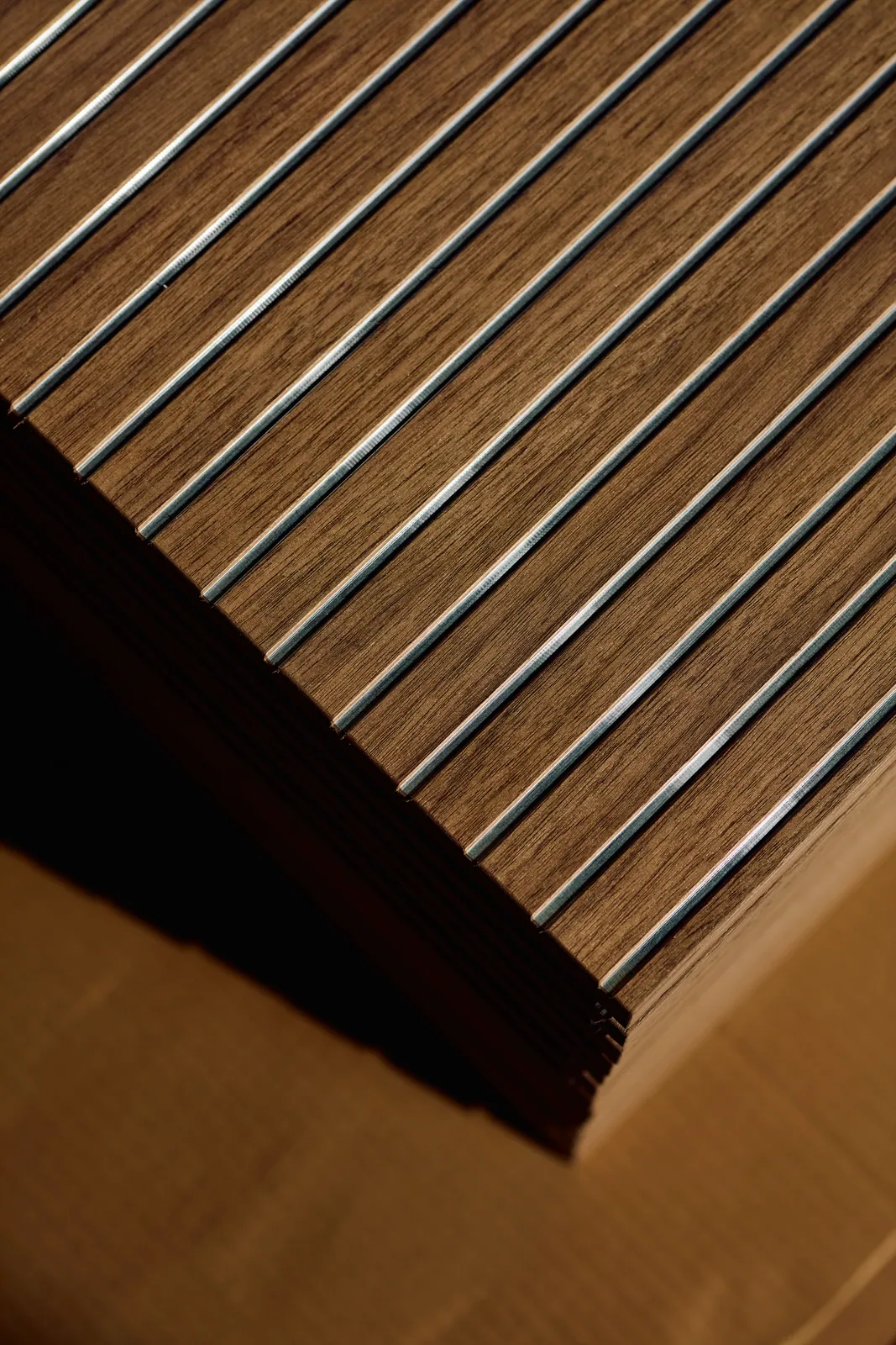
« Matte does not seek to be seen. It lets the light work and the space breathe. »
Where matte lacquer truly works
It is on large, continuous surfaces that it reveals its full interest. A few examples where we often recommend it:
- Handleless kitchen fronts, where the smooth, matte surface draws a clean volume, without any break of light.
- Full-height storage and closed bookcases, which become inhabited partitions rather than pieces of furniture set against a wall.
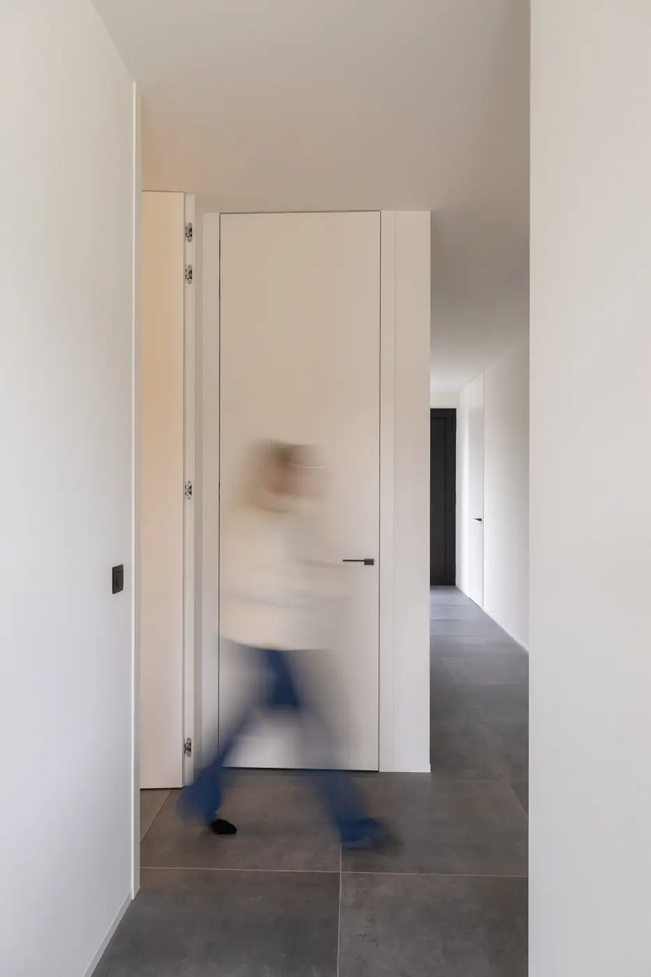
- Interior doors, especially full height, where matte accentuates the sense of continuity with the wall and erases the presence of the leaf.
Conversely, in a very dark or poorly lit room, a matte that is too deep can weigh the whole down. It is a matter of balance: we adjust the shade according to the natural light, and sometimes dare a matte off-white rather than an anthracite when the room lacks daylight.
Marks and upkeep: the useful truth
Let us speak plainly about what worries people most: fingerprints. A first-generation matte lacquer did mark, that is true, especially in the darker shades. The surfaces we use today are treated to resist marks: a film that stands up to fingerprints and cleans easily. The real sensitivity always depends on the shade, a black remaining more demanding than a beige, but we are far from the constraints of the past.
Upkeep stays simple, provided you respect a few principles. A soft microfibre cloth, lightly damp, is enough for everyday care. For stubborn marks, use a neutral cleaner, never an abrasive product or a scouring cream, which would end up polishing the matte and creating irrecoverable glossy patches. Avoid scouring pads and rough cloths as well. A regular, gentle gesture is always worth more than an aggressive deep clean.
This is where the reputation of matte is decided. Well chosen, well finished and cared for without excess, it keeps its uniformity for years. Sobriety is not a fragility: it is a finish that asks little, provided it is respected. And that is no doubt why it has become, in the workshop as in people's homes, a lasting value rather than a fashion.